Statistics
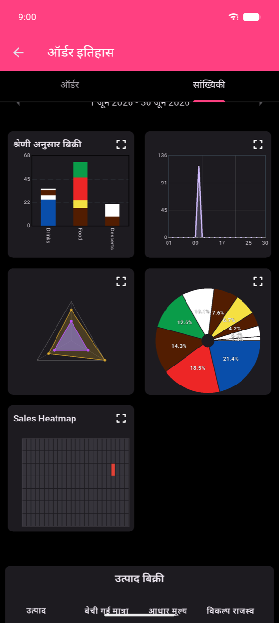
ऑर्डर इतिहास के अंदर Stats tab आपके placed orders को charts और sortable product table में बदलता है। होम मेनू से ऑर्डर इतिहास खोलें, फिर Stats tab टैप करें।
Time period चुनना
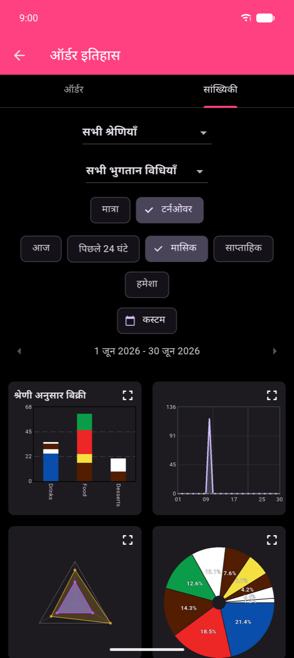
छह period chips हर chart और table पर apply होने वाली date window control करते हैं:
| Chip | Resolution |
|---|---|
| आज | Hourly |
| Past 24h | Hourly (rolling 24-hour window) |
| साप्ताहिक | Daily |
| मासिक | Daily |
| हमेशा | Daily |
| कस्टम | Daily (या hourly for sub-24h ranges) |
साप्ताहिक, मासिक, और कस्टम active date span के साथ ‹ और › arrows दिखाते हैं — एक period आगे या पीछे जाने के लिए टैप करें।
Note
आज आपके device के local time में midnight से midnight तक होता है। Midnight के बाद placed orders नए calendar day से attributed होते हैं। यदि आपकी venue midnight के बाद चलती है, तो rolling 24-hour view के लिए Past 24h use करें, या अपने exact shift hours match करने के लिए कस्टम use करें।
Custom date और time range
अवधि चुनें dialog खोलने के लिए कस्टम टैप करें।
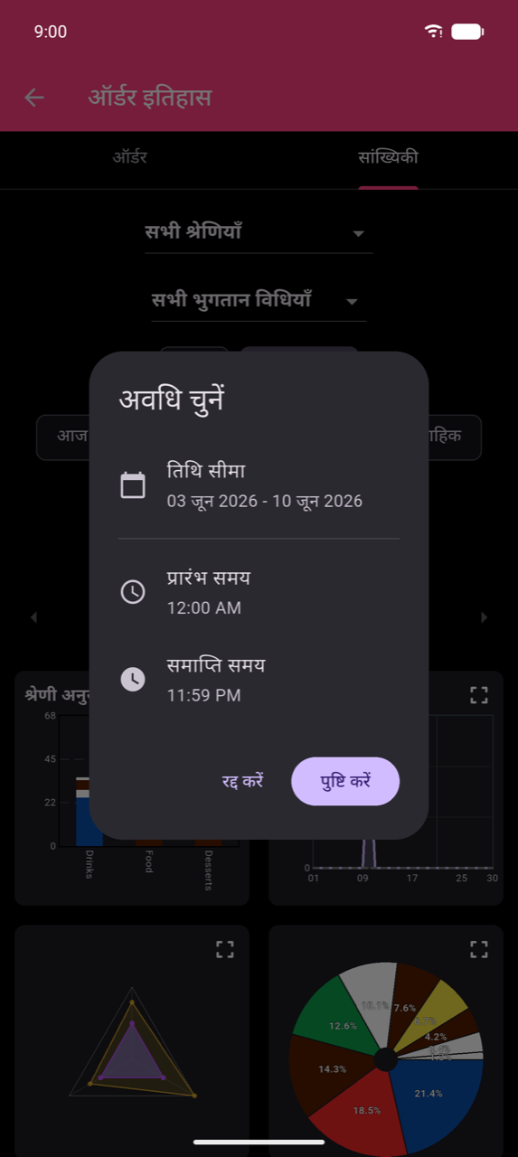
Start और end dates चुनने के लिए तिथि सीमा टैप करें। यदि window को दिन के specific hours तक restrict करना है तो प्रारंभ समय और समाप्ति समय adjust करें — एक single shift analyze करने के लिए useful। Apply करने के लिए Confirm टैप करें।
Filters और group-by
Charts के ऊपर तीन controls हर chart और table क्या measure करे यह refine करते हैं:
- All Categories dropdown — एक category पर filter करें या All Categories रखें।
- All payment methods dropdown — एक payment method पर filter करें।
- Amount / Turnover toggle — item count (Amount) और currency में revenue (Turnover) के बीच switch करें।
Note
जब category filter active हो, तो हर chart केवल उस category का sales में contribution दिखाता है। Multiple categories से items वाला एक single order उन categories में split होता है — इसलिए Drinks के लिए दिखाई संख्या और Food के लिए दिखाई संख्या केवल उनका share reflect करती हैं। इसका मतलब है per-category totals All Categories total से कम होंगे; यह expected behaviour है, counting error नहीं। Category select करने से Radar chart भी छुप जाता है (इसके लिए सभी categories चाहिए)।
Charts
पाँचों charts एक scrollable 2-column grid में दिखते हैं। हर card एक expand icon दिखाता है — बड़ा करने के लिए उसे टैप करें (या card टैप करें)। Enlarged view में, overview पर वापस जाने के लिए grid icon टैप करें।
Sales by Category (bar chart)
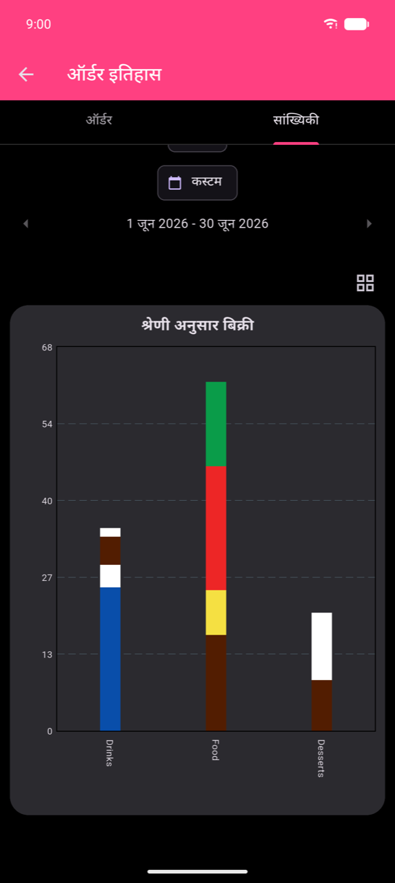
Stacked bars category के अनुसार sales दिखाते हैं, हर color segment एक product represent करता है। Category filter active होने पर, title Sales in [Category] में बदल जाता है और bars उस category के individual products दिखाते हैं।
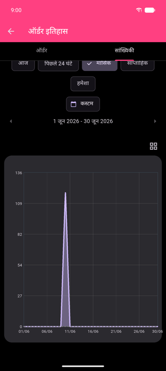
Sales over time (line chart)
प्रति दिन sales plot करता है — या आज / Past 24h के लिए प्रति घंटे। Comparison के लिए equivalent previous-period values दिखाती dashed overlay।
Note
Line chart के लिए selected period में कम से कम 15 orders चाहिए। कम orders होने पर chart "Not enough data for Line Chart" दिखाता है।
Average by day of week (radar chart)
Week के हर दिन के average sales दिखाता polygon chart, categories represent करते axes। केवल तभी available जब All Categories selected हो, period आज या Past 24h न हो, और catalogue में कम से कम तीन categories हों। Fewer categories या daily resolution के साथ, chart "No data for Radar Chart" दिखाता है।
Category share (pie chart)
Segments percentage labels के साथ total sales में हर category का share दिखाते हैं।
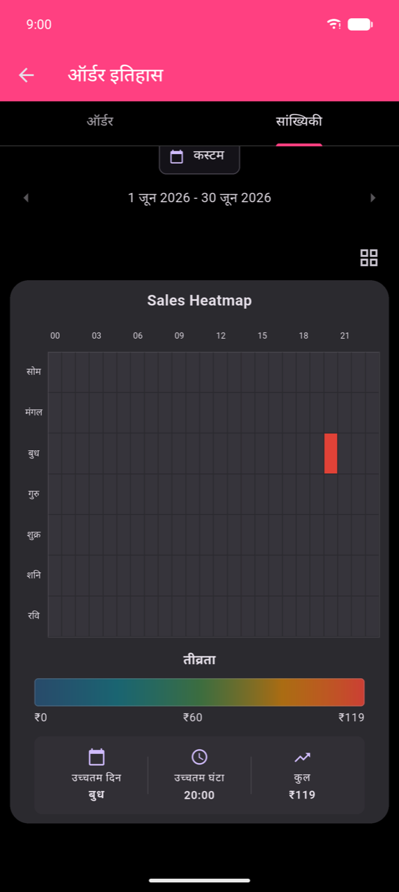
Sales Heatmap
Days (Mon–Sun) × hours (00–23) का 7 × 24 grid। Cell color intensity sales volume represent करती है। Value और order count देखने के लिए कोई भी cell टैप करें। Enlarged view तीव्रता color scale और उच्चतम दिन, उच्चतम घंटा, और Total के summary tiles जोड़ता है।
Note
Sales Heatmap केवल 28 दिन या उससे अधिक के periods के लिए दिखती है। इसे enable करने के लिए मासिक, हमेशा, या कम से कम 28 दिनों की कस्टम range use करें।
Product sales table
Charts के नीचे, Product sales table selected period में बेचे गए हर product list करता है।
| Column | Meaning |
|---|---|
| Product | Product का नाम |
| Amount sold | बेची गई units की संख्या |
| Base Price | Product की configured list price |
| Options Revenue | इस product पर paid add-on options से earned total revenue |
| Average selling price | Total turnover ÷ units sold — options सहित actual mean paid per unit |
| Turnover | Base revenue plus options revenue |
| Profit | Turnover minus cost (positive होने पर हरा, negative होने पर लाल) |
Sort करने के लिए कोई भी column header टैप करें। नीचे Totals for selected period सभी products में Total turnover और Total profit दिखाता है।
Note
Options Revenue वह amount capture करता है जो customers ने add-ons (जैसे "Extra shot") के लिए base price से अलग pay किया। इसलिए Average selling price किसी भी product के लिए Base Price से अधिक है जो paid options के साथ frequently ordered हो — यह actually charged का mean है, catalogue price नहीं।
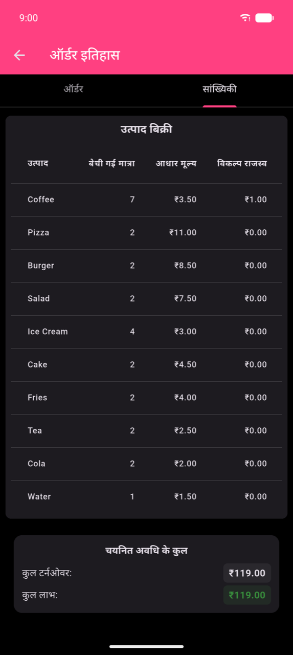
Table और totals print करने के लिए रिपोर्ट प्रिंट करें icon (All Categories dropdown के बगल में) टैप करें। Configured printer required है।