Statistics
The Stats tab inside Order History turns your placed orders into charts and a sortable product table. Open Order History from the home menu, then tap the Stats tab.
Choosing a time period
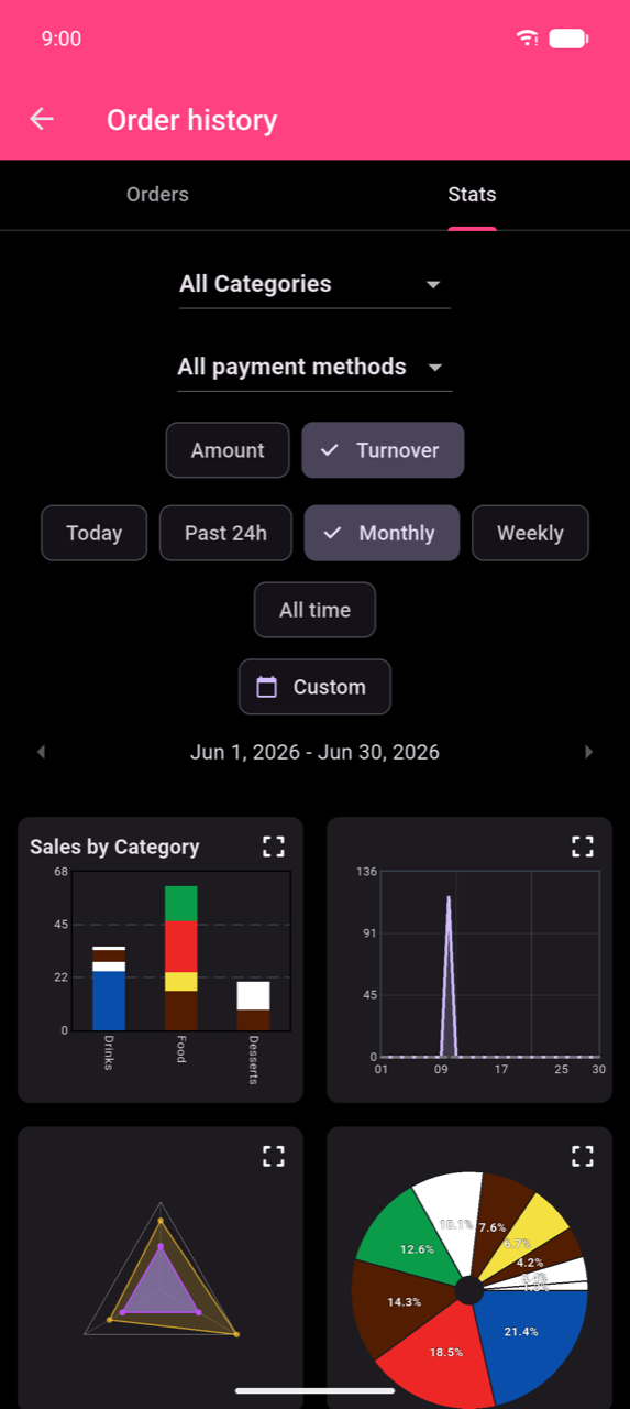
Six period chips control the date window applied to every chart and table:
| Chip | Resolution |
|---|---|
| Today | Hourly |
| Past 24h | Hourly (rolling 24-hour window) |
| Weekly | Daily |
| Monthly | Daily |
| All time | Daily |
| Custom | Daily (or hourly for sub-24h ranges) |
Weekly, Monthly, and Custom show ‹ and › arrows alongside the active date span — tap to step one period back or forward.
Note
Today spans midnight to midnight in your device's local time. Orders placed after midnight are attributed to the new calendar day. If your venue runs past midnight, use Past 24h for a rolling 24-hour view, or Custom to match your exact shift hours.
Custom date and time range
Tap Custom to open the Select Period dialog.
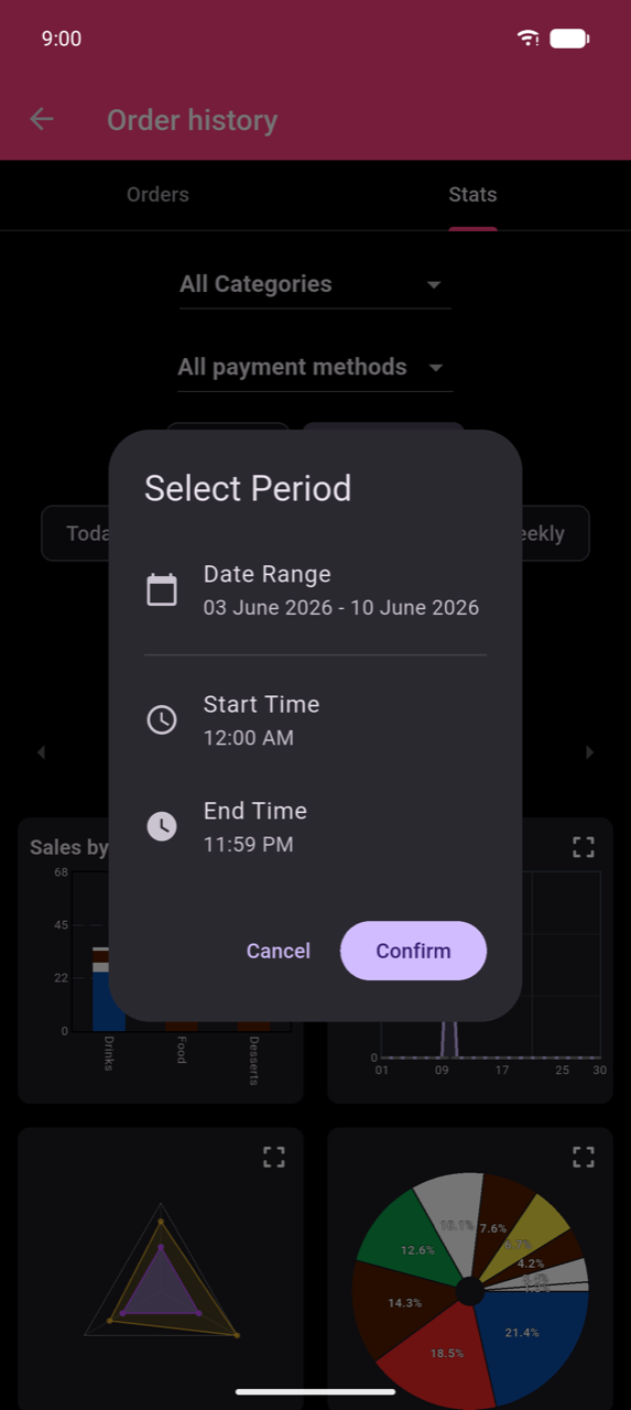
Tap Date Range to choose start and end dates. Adjust Start Time and End Time if you want to restrict the window to specific hours of the day — useful for analysing a single shift. Tap Confirm to apply.
Filters and group-by
Three controls above the charts refine what every chart and table measures:
- All Categories dropdown — filter to one category or keep All Categories.
- All payment methods dropdown — filter to one payment method.
- Amount / Turnover toggle — switch between item count (Amount) and revenue in currency (Turnover).
Note
When a category filter is active, each chart shows only that category's contribution to sales. A single order containing items from multiple categories is split across those categories — so the number shown for Drinks and the number shown for Food each reflect only their share. This means per-category totals will be lower than the All Categories total; that is expected behaviour, not a counting error. Selecting a category also hides the Radar chart (it requires all categories).
Charts
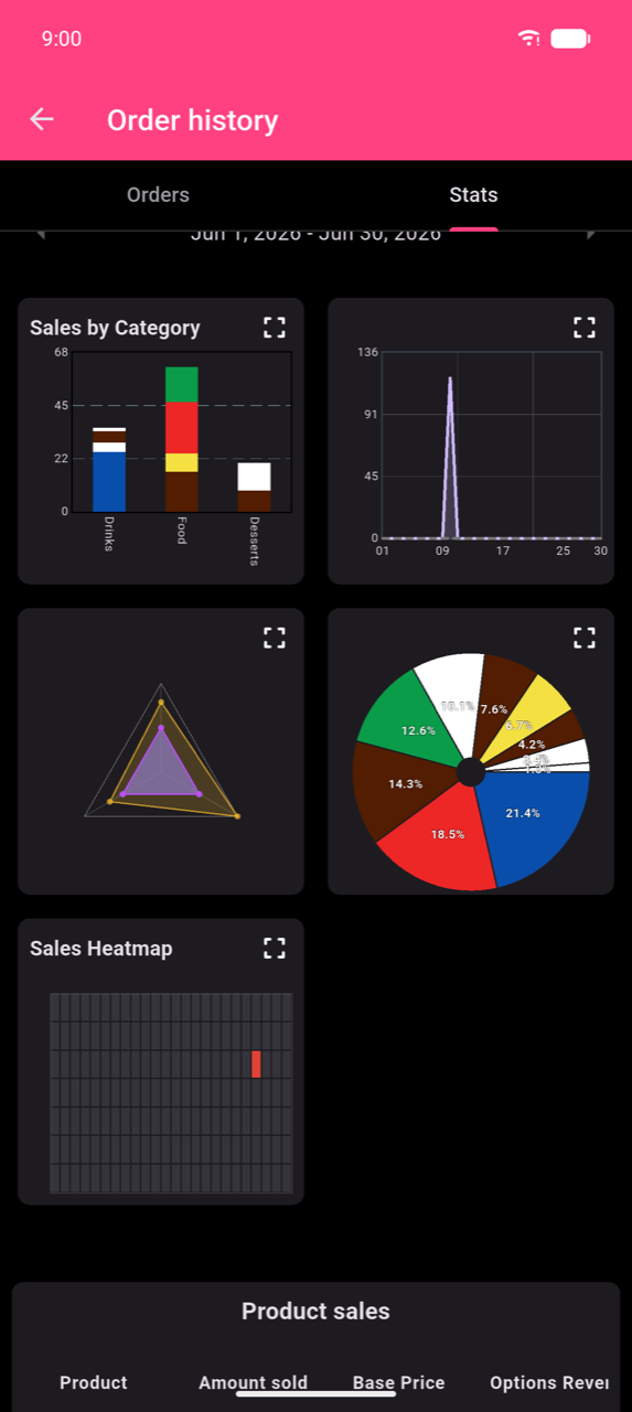
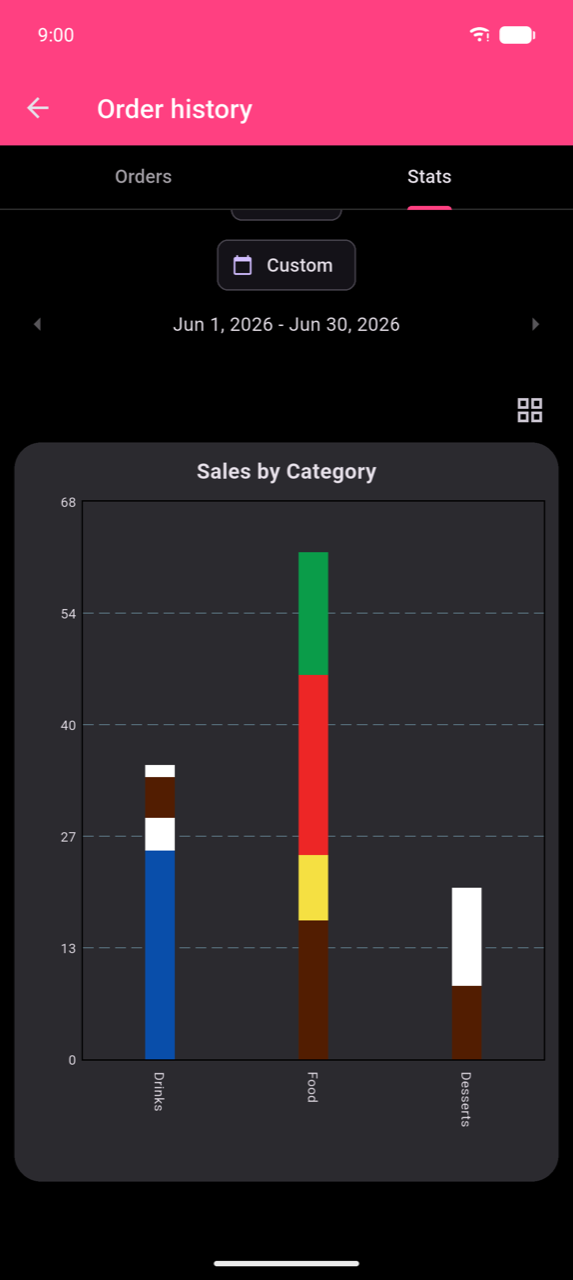
All five charts appear in a scrollable 2-column grid. Each card shows a expand icon — tap it (or tap the card) to enlarge. In the enlarged view, tap the grid icon to return to the overview.
Sales by Category (bar chart)
Stacked bars show sales per category, with each colour segment representing a product. When a category filter is active, the title changes to Sales in [Category] and bars show the individual products within that category.
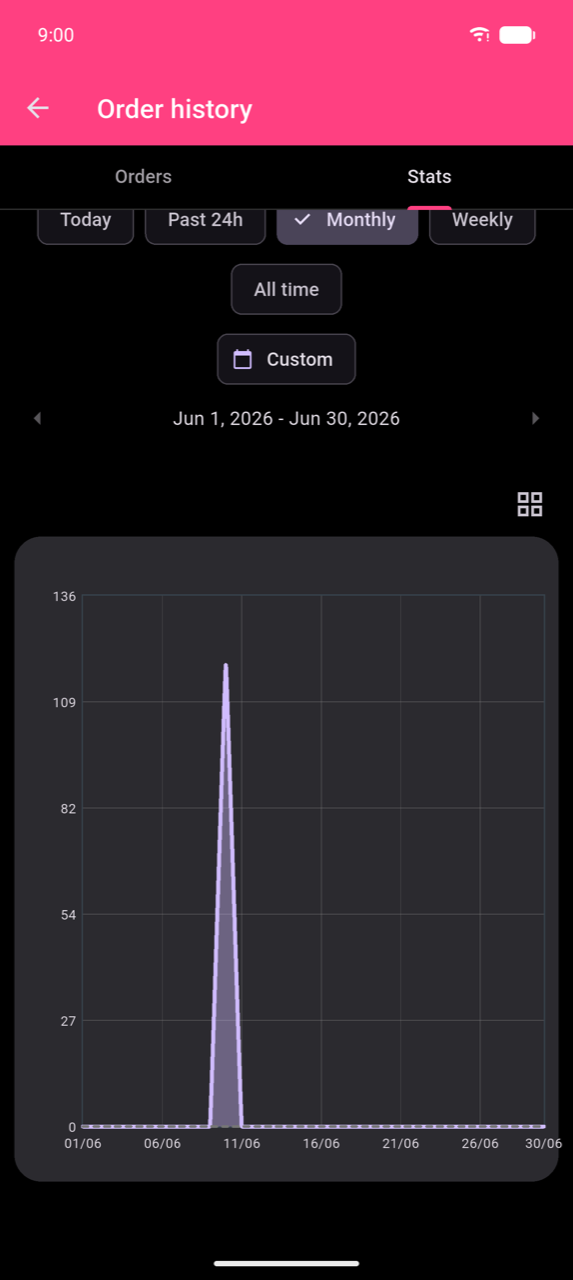
Sales over time (line chart)
Plots sales per day — or per hour for Today / Past 24h. A dashed overlay shows the equivalent previous-period values for comparison.
Note
The line chart requires at least 15 orders in the selected period. With fewer orders the chart shows "Not enough data for Line Chart".
Average by day of week (radar chart)
A polygon chart showing average sales for each day of the week, with axes representing categories. Only available when All Categories is selected, the period is not Today or Past 24h, and the catalog contains at least three categories. With fewer categories or a daily resolution, the chart shows "No data for Radar Chart".
Category share (pie chart)
Segments show each category's share of total sales with percentage labels.
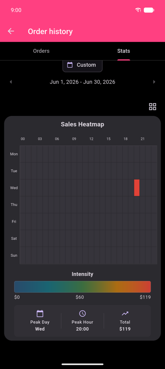
Sales Heatmap
A 7 × 24 grid of days (Mon–Sun) by hours (00–23). Cell colour intensity represents sales volume. Tap any cell to see its value and order count. The enlarged view adds an Intensity colour scale and summary tiles for Peak Day, Peak Hour, and Total.
Note
The Sales Heatmap only appears for periods of 28 days or longer. Use Monthly, All time, or a Custom range of at least 28 days to enable it.
Product sales table
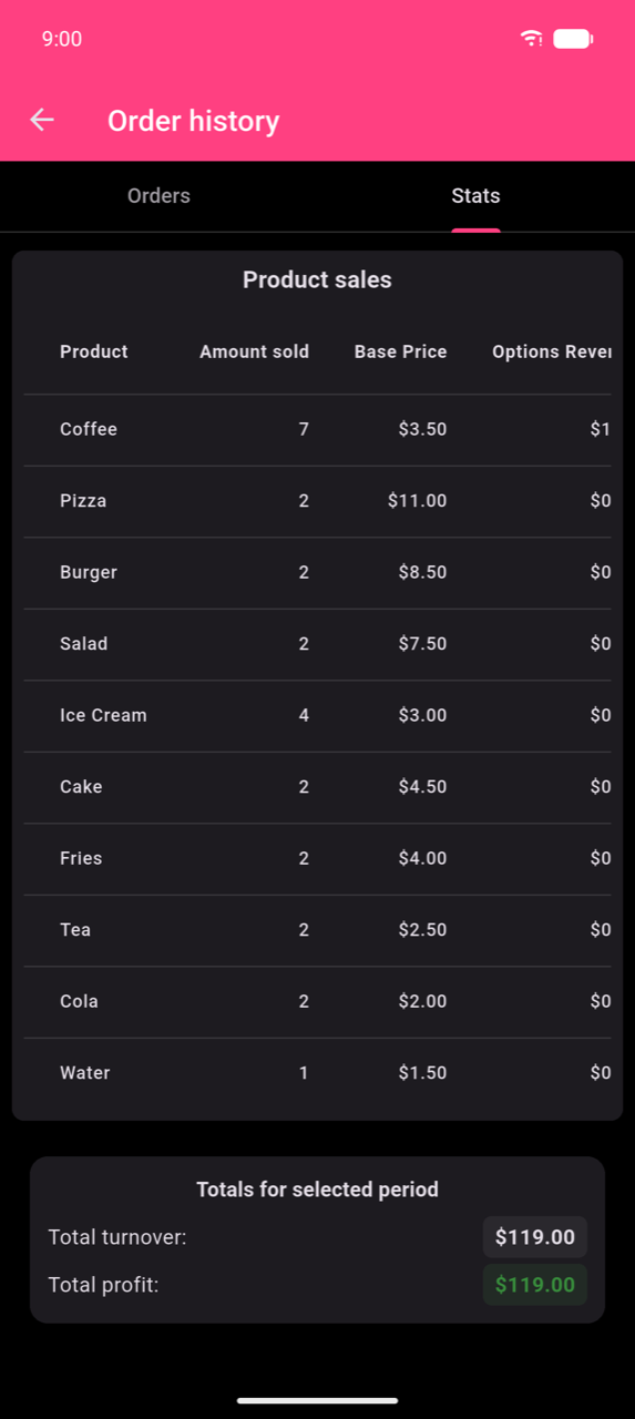
Below the charts, the Product sales table lists every product sold in the selected period.
| Column | Meaning |
|---|---|
| Product | Product name |
| Amount sold | Number of units sold |
| Base Price | The product's configured list price |
| Options Revenue | Total revenue earned from paid add-on options on this product |
| Average selling price | Total turnover ÷ units sold — the actual mean paid per unit, including any options |
| Turnover | Base revenue plus options revenue |
| Profit | Turnover minus cost (green when positive, red when negative) |
Tap any column header to sort. Totals for selected period at the bottom shows Total turnover and Total profit across all products.
Note
Options Revenue captures what customers paid for add-ons (such as "Extra shot") separately from the base price. Average selling price is therefore higher than Base Price for any product frequently ordered with paid options — it is the mean of what was actually charged, not the catalogue price.
Tap the Print Report icon (beside the All Categories dropdown) to print the table and totals. A configured printer is required.